Concept and design for living products
Good design contains function, communicates, and has a purpose. I've done lots of designs where aesthetics is immediate. However, my designs have other than beauty and colors as an agenda. The aesthetic teases your senses and invites us to the dialogue that the design has in it. I hope you experience my designs like this - whether it is as a craft in gold or it is a concept for functional products that make children predisposed to become healthier adults.

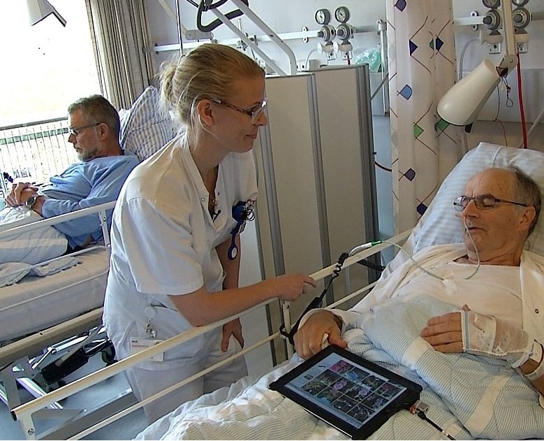
Designs to the Super Hospital AUH
Prototypes
International Profile
Functionality, Communication, Contemporary
Public Textiles
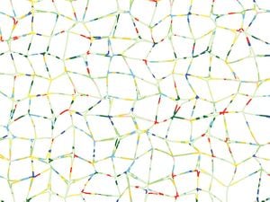
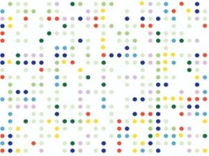
What is important when you need a new duvet cover for all the beds and ambulances in the new biggest colorful hospital in Denmark?
N1 - Handmade jewelry
Gold-Silver Collection 2006
Unique Craftsmanship
Aesthetic, Contemporary
Jewels Collection. Women's Beauty
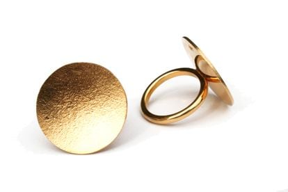
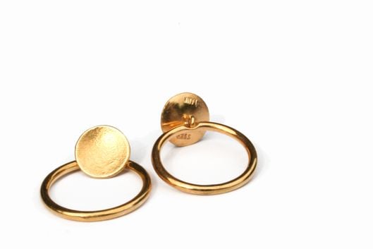
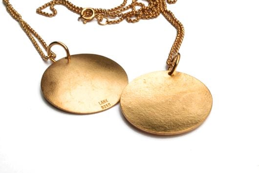
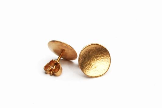
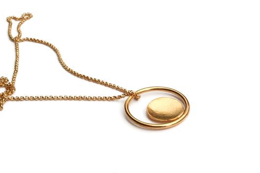
Handmade jewelry in silver with gold plating. 2 rings. two chains with pendants. A pair of ear studs.A collaboration between SKAKS & Goldsmith Karsten Lank.
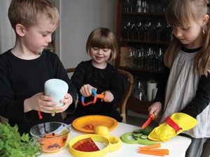
Tableware "Kitchenkids"
Bodum design award
Award-Winning
International Profile
Functionality, Contemporary
Children´s Empowerment
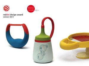
Bodum design award was the Nordic region's largest design award in 2011. It was an honor to receive an award for concept and product design.
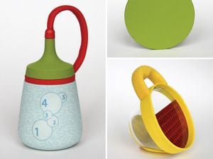
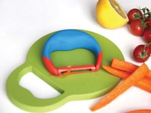
"Kitchen Kids". Concept and design in collaboration with Josefine Bentzen. - Prototypes.
Bodum Design Award 2011
Red Dot Design Award 2011
Exhibited at Philadelphia Museum of Art 2012
Visual communication
How can you communicate a message very simply.
Do it with a shape. With a logo, a color. With typography. Or with a pattern.
I have uploaded a few cases on it.
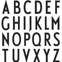
A logo worthy of Arne Jacobsen's font
The exclusive right of use of a font
Danish Profile
Communication. Contemporary
Graphic design, Web design, Company Concept.
How do you know if you are getting quality from an upholsterer?
By having a stamp of quality!
Concept and graphic design with permission to use Arne Jacobsen's font
Pink Ribbon
Danish Profile
Contemporary Communication.
Logo design. Wallpapers. Campaign Concept
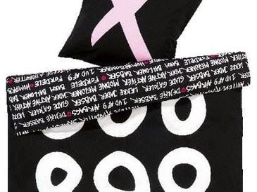
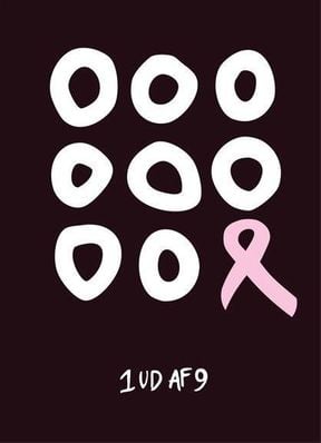
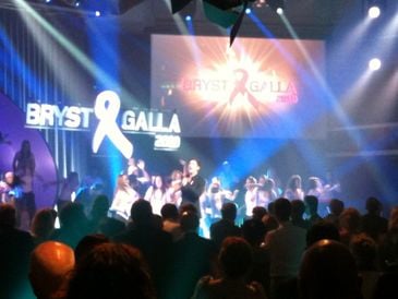
I had the honor of being the designer of the Danish Pink Ribbon logo and the campaign “Pink Ribbon 2010″.
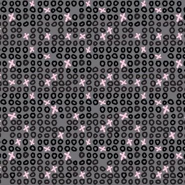
As a designer, it is a pleasure to contribute with 3 wallpapers/patterns and the first Danish Pink Ribbon bow.
In my work as a designer I am used to relating to variable products with many different types of surfaces, so designing for the Pink Ribbon campaign stays within my line of work.
I hope that my designs on various Danish products can increase the impact in this year’s campaign.
It has been my desire to get the message “1 out of 9″ communicated in a visual message. Sometimes it is easier to understand statistics when they are transformed into images: 8 healthy sets of breasts and then 1 with a cancerous tumor, illustrated by the bow.
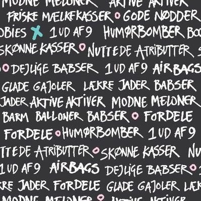
Breasts are called many different names and I asked my 164 Facebook friends for help to come up with some of the many nicknames breasts are called – this gave me some inspiration. In addition I asked for a roundtable at a gentlemen,’s club. It paid off! Because who knows better than men, what wonderful words exist for breasts?
The core of the aesthetic is my handwriting, my personal signature, and my devoted greetings to all those who look after and care for breasts. Here and there the text says “1 out of 9″, because unfortunately, all breasts are in the line-up – also the ‘titties’, ‘the big melons’, ‘the boobs’, ‘the
jugs’ and ‘the hooters’. The message is not meant to create fear, but we must all be aware so that tumors are discovered in time.
Personally, I was 1 out of the 9 who found a tumor, but fortunately, I am a survivor and today I’m perfectly healthy.
I would like you to support the Cancer Society and the Pink Ribbon Campaign 2010, because it is designed to support invaluable research,information, and efforts on breast cancer.
The Ribbon is registered as an NFTartwork and is free to use. You should be welcome to donate to the fight against cancer/support the breasts if you use it. If you would like a pdf file sent, you are welcome.
Sincerely,
Charlotte Skak

Textiles speak...
...through their aesthetics; they must always contribute to the functionality of the holistic solution they are part of. Textile design can rarely be seen as an isolated topic but often operates in close context with another area of design, i.e. fashion-, interior-, room, or object based design.
As a designer I have worked with holistic design. I have made international bestsellers for IKEA. Aestetic I juggle with everything from white tactile collections to multicolored graphic patterns and natural colors. Textiles are surfaces that accompany our lives, Let them speak.
IKEA Ofelia
Textile Collection
IKEA Classic for 12 years
International Profile
Concept, Collection, Qualities, Functionality, Contemporary
Homeware. Textiles
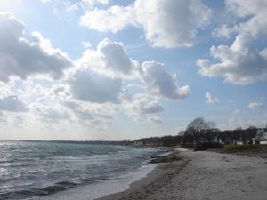
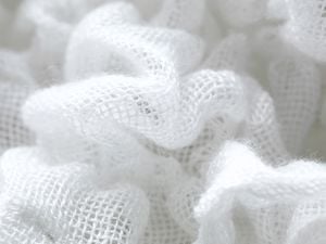
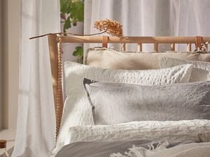
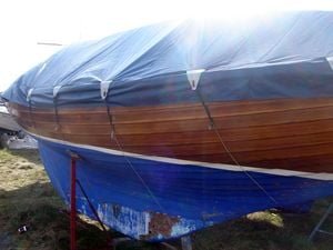
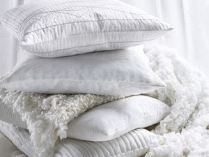
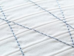
Ikea Ofelia was a large white textile collection at IKEA. The whole expression lay on the surfaces of the textiles. The inspiration was Snekkersten beach and harbor as well as the mindfullness nature gives here. Peace of mind. Presence. Sensuality. The collection has existed from 2008-2020
IKEA ANDREA
Textile Collection 2006
Worldwide Bestseller, sold millions worldwide.
International Profile
Functionality, Contemporary
Homeware. Textiles
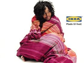
The task IKEA gave me was to draw an ethnic-Asian collection but with a distinct Nordic touch.
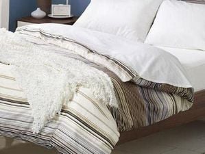
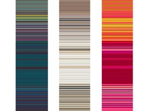
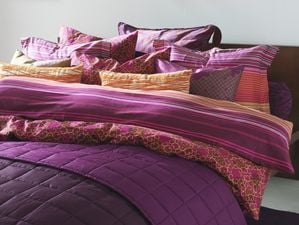
Andrea was consisting of duvet covers, cushions, tablecloths, tassels, etc. The multicolored striped duvet cover “Andrea Satin” (the stripes) became a worldwide bestseller for 6 years.
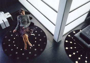
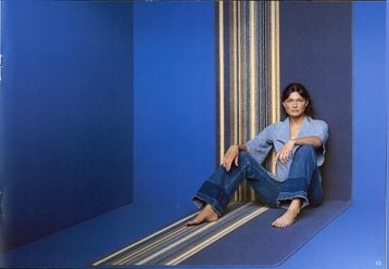
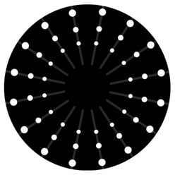
RUGS
International Profile
Concept, Contemporary Colletion
New digital techniques
Homeware. Textiles
Nordic rugs for private homes.
Collections. Concept & Design - Ege Carpets
